
Overhauling notifications - DHL
Client
DHL
Role
Product Design
Year
2024
At Hillebrand Gori, notifications were essential for keeping users informed about their shipments and logistics operations. However, as our platform expanded and our user base grew—particularly among larger accounts—the existing notification system began to show its limitations.
Tailoring communication for a better user experience
Users reported feeling overwhelmed by the sheer volume of notifications, many of which lacked clear relevance. They also expressed frustration with the limited options for customization, which made it difficult to tailor notifications to their specific needs.
Faced with these challenges, we recognized the need for a comprehensive overhaul of our notification system. This initiative aimed to better serve our users by addressing their pain points and ensuring that the notifications they received were both useful and manageable.
A new vision for notifications
Our vision was to create a notification system that was not only more informative but also more relevant to each user’s specific requirements. We sought to empower users by providing them with greater control over the notifications they received, thereby reducing the noise of irrelevant alerts. At the same time, we aimed to make important information easily accessible, regardless of how complex a user’s logistical operations might be.
Optimizing the notification system
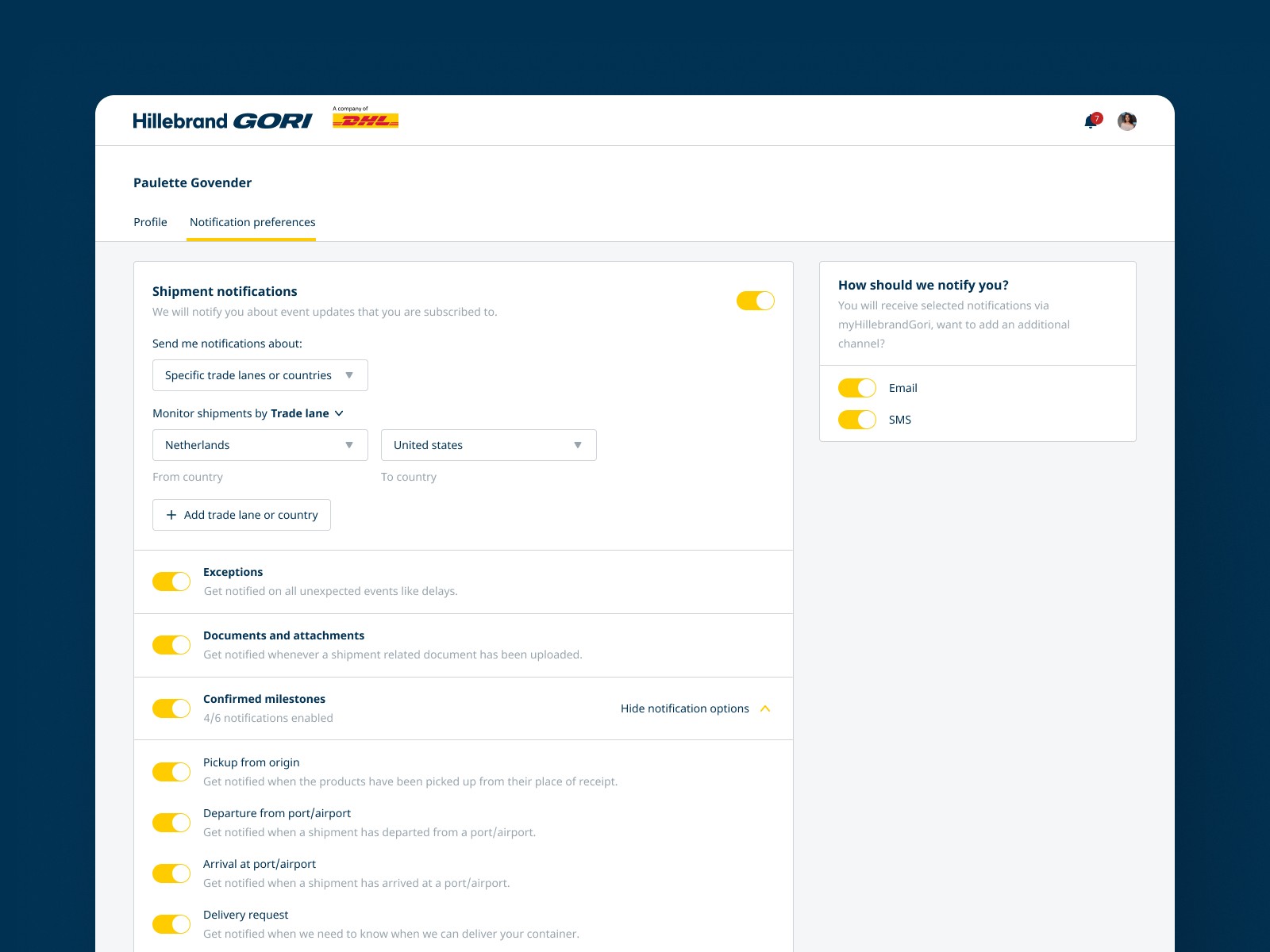
Enhancing notification preferences
To bring this vision to life, we began by rethinking the notification preferences page. Previously, users had only a limited ability to customize their notifications, often having to choose between receiving alerts for all shipments or just those that were flagged or favorited.
Recognizing the need for more granularity, we introduced new filtering options. These options allowed users to receive notifications based on specific criteria, such as shipments they were directly involved in, particular origin or destination countries, or even specific trade lanes.
This change not only made the notification system more user-friendly but also ensured that users received alerts that were truly relevant to their roles and interests.

Redesigning notification emails
The next focus was on notification emails. Users with large accounts had reported difficulties in connecting notifications to specific shipments because the emails only displayed the shipment reference. To address this, we enhanced the information provided in each notification email.
We added key details such as the seller and buyer of the goods, as well as the locations where the shipment was coming from and going to. This made each notification far more informative and easier to contextualize.
Additionally, we revised the digest format of the emails. Previously, these digests grouped notifications by event type, which made it challenging for users to track specific shipments. We revamped this by grouping notifications by shipment and incorporating the enhanced information within each group. This provided users with a clearer, more organized summary that better met their needs.
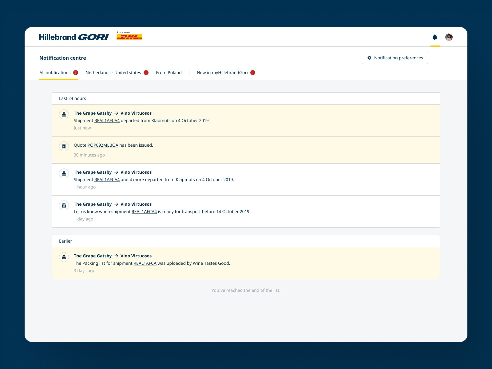
Revamping in-app notifications
Finally, we turned our attention to in-app notifications. Like the email notifications, the in-app alerts needed to provide more relevant details without overwhelming the user. We added buyer and seller details to the in-app notifications, ensuring that users could quickly understand the context of each alert.
Moreover, the in-app notification page was enhanced with tabs that corresponded to each setup created on the Notification Preferences page, such as specific origin/destination countries or trade lanes. This allowed users to filter notifications directly within the app, making it easier for them to focus on the most important updates.
From prototyping to implementation
After redesigning the notification system, we developed prototypes to test the new features. User testing was a crucial part of this phase, allowing us to gather feedback on how effectively users could manage their notifications, the clarity of the new email formats, and the usability of the revamped in-app notifications.
The response from users was overwhelmingly positive. They appreciated the increased control over their notifications, the added clarity in emails, and the ease of navigating in-app notifications with the new tabbed structure.
The notification overhaul was rolled out incrementally, which allowed us to continue gathering feedback and make further adjustments as needed. The impact was clear: users, particularly those with large accounts, felt more in control of their notifications and reported a significant decrease in notification overload.
Reflection and lessons learned
This notification overhaul was more than just a series of incremental improvements—it was a fundamental rethinking of how we communicate with our users. By listening closely to user feedback and focusing on their specific needs, we were able to create a notification system that is not only more effective but also more closely aligned with how our users actually work.